Showing posts with label Broadening. Show all posts

Saturday, 8 June 2013

Zentangle

I did a bit of zentangle work in my A3 sketchpad - I really enjoy working with the patterns and think the combinations of patterns (or 'tangles') look really nice. The details are fascinating.

I can see how these could be worked into fabric pattern design, or inspiration for other textile work.


Sunday, 19 May 2013

Exhibitions and Sketches

First up, sticking things I found pretty on paper and exploring them. Then getting distracted by a bird I saw as I was making vectored birds for pattern design (perhaps more on that later). Also a bit on combining the Southbank centre line style I liked with Audrey Walkers stitching technique combined further by exploring stitching on paper.... I'm liking how much I've learned already - I'm pretty sure thats a big part of this learning process right there!

Can you guess which exhibition I went to?

This is a bit of a combination of the colour theory technique application I read about in Colour Index 2 (see my review: Book Thoughts - Color Index 2 by Jim Krause) and seeing Lichtenstein apply that technique! Lichtensteing does not use the right colour for the lady's skin but he does use the right value which is why our brain doesn't scream 'its wrong' at us.

I'm really pleased with this page. I saw 'Sunrise' 1965 and could not figure out during the exhibition itself how he managed to make the layers 'pop out'  - at first I genuinely thought the clouds/mountains were on a separate layers of clear acrylic in front of the rest. So I bought the postcard to explore later. I thin figured out the extra thick lines at the bottom in comparison with the thinner lines at the top trick the eye into seeing it as perspective. So I tried it on my bird from 3 pages up /\ /\ /\. In combo with some   desaturated benday dots and more of my Finland tree obsession in the background with even thinner lines (desaturation is also a perspective trick I've read about in 'the artist' magazine) I think it was very successful in making the bird look like it is projected upwards from the paper. I'm also please that this uses just 4 colours so it could be a very successful way of doing fabric pattern design doesn't necessarily have to be photo-style printed.

I bought postcards of the images I loved the best so that I could explore them and figure out why I love them so much,

I then tried to explore them by either imitating the style or exploring the technique.


Wednesday, 15 May 2013

Some more sketchbook work

So I was having a look at the suggested reading in the learning folder and decided to look up the UK Fashion and Textile association http://www.ukft.org. If you go to the 'business' tab and select 'publications' you can find a document that they publish (I assume every year) called the British Textile Colour Card. Which is a collection of colour schemes that are, forgive the Zoolander phrase, 'so hot right now'. Not just the colours but a lowdown on the mood that they embody and also some close ups of some amazing current textiles that blend into that theme. So heres also a link direct to the British Textile Colour Card 2014[pdf].


This was my attempts to get down on paper ideas I had buzzing around my head inspired by combinations of Pinterest, the Southbank Centre's light show exhibition and architecture/interior sketches that I'm doing all the time separate from textiles course sketches. It is a sad looking piece of A3 mainly due to the lack of resources I have in London with me in my little uninspiring room! I can however say with perfect certainty that I know exactly what I am taking about here, have figured out the proportions I would like should this be done in the future, and most importantly, the obsession buzz was quietened by getting the idea out on paper.

I was also attempting to use A3. Not loving it so far...!


Again with the forcing A3, this was me planning out my final section of Stage 6. I'm rotating back to the landscape, stormy colours and trees theme that has been running through my sketchbook work to "develop in terms of image making". So this is me working out my idea on paper first with colour pencils before making may sample based on that imagery. I love the yarn wrapping - I'm using the techniques I've learned to develop my work. After the slate sample I wasn't happy with in assignment 1 I'm glad I did this so I know my colours and threads look pretty darn good together.

I also used MS Paint to kind of 'pixellate' my image since I was working with french knots, and also drew the silhouette that will be the background fabric showing through the stitching. I'm still not loving working with A3. I write and draw so small - need to work on that so that all that white space doesn't look so lonely!

I was going to introduce this sketch by saying "in a book unrelated to textiles..." but that wouldn't strictly be true because its a design book. So: In a design book "Creative Workshop: 80 challenges to sharpen your design skills" by David Sherwin I was reading how sometimes the best creativity comes by making fast decisions and throwing out all kinds of ideas. The 80 challenges give time frames that range from 30 minutes to 2 hours and he makes a point that you can do great things in such short timespans. So I applied this and tried it out with some colour combos. I set a bleeping timer on my phone to remind me to think quick and move on!

I noted my favourite combos on the right and plant to revisit every so often to see if my tastes change with the seasons/fashions/my own learning.

Wednesday, 24 April 2013

Book Thoughts - Color Index 2 by Jim Krause

So this book was part of a three book set all to do with design. It came in an orange box and I think the others were about typography and design basics. I've had the set for years as one of my mums cast offs but never really sat down to read them. I read this one since I was on the colour chapter and I'm so glad I did. Jim Krause explains the basics really well and has some beautiful crystal clear diagrams to show what he's talking about. He doesn't just talk about the fundamentals but explains how to use them in design. I especially liked his section on Value vs colour and I pretty much copied his examples into my sketchbook/workbook.

Here are a few pictures but at a low resolution as I don't want to discredit him!


After the short but learning filled intro you have hundreds of pages with tons of colour combinations. They are sorted first by main colour and then by the type of colour scheme i.e. monochromatic, triadic, analogous & complementary. A beautiful book which I have found SO helpful now that I appreciate it.


Each colour scheme is presented in a page wide vectorised image or pattern - great for comparisons, but also varied enough that you don't get bored of the same image repeated so many times over.


p.s. did I mention he gives CMYK and RGB codes for each colour? Its also worth properly reading the intro and 'how to use this book' section because it explains about expansion palettes, observing colour as an artist and how the colours are laid out to show which colours 'belong' to that section.


p.p.s. I believe Color Index 1 is similar but with schemes made up of 2 & 3 colours where as this is 3,4 & 5 colours.

Friday, 19 April 2013

Sketchbook pages


 Notes on colour schemes and planning out Stage 5's embroidery. I'm also really thinking about going to the Tate Modern's Lichtenstein exhibition!

Here I've been pretty inspired by the views from my work (I'm an air traffic controller and sit in a tower, looking out of windows all day). My colours were mainly decided by the pens I had brought to London with me! A repeating theme in my sketches has been tall thin evergreen trees which were a large feature in our honeymoon to Finland. I used to think that fat wide christmas trees were the best proportions but our week in the arctic circle surrounded by such beauty changed that! On the right are emerging observations from my blue and yellow stitching I'm working on for Stage 5. I'm really not loving working with primary colours as I find it hard to look through the brightness to properly see the effects! 

This is some sketches from visiting the South Bank Centre where I became a member. The theme of the month was the 'Alchemy' festival which was celebrating South African culture. Again, bright bright, primary colours which were deliberately being clashed..! But lovely watching some traditional dyeing, looking at the patterns and admiring the quilting.

 Starting to become more and more tree obsessed and even more looking forward to Lichtenstein...

 I went to see the light show at the Southbank Centre and was absolutely mesmerised by some of the exhibits. This page was however showing some sketches of the side exhibition: Aura Satz: Impulsive Synchronisation. It was a projector on a screen which had morse code/computer code holes punched in it. The projector pulsed an image on it in a pattern which was also mesmerising. I loved the light and the layers building up a 4d texture. I also started planning a massive day trekking around 4 museums in a day (I only managed 3)

And this was the result of some of that museum filled day. Not much sketching to show for it all but I was certainly inspired!

Wednesday, 17 April 2013

Saturday, 30 March 2013

Fist post after colour lacks colour

So to make matters a bit more complicated. I move jobs. Being in the military I am posted every few years. My new job is within what I consider to be 'London' and though sometimes I'll be able to commute, most of the time it won't be worth it due to the time to plow through the dreaded traffic.

So I have some faceless accommodation to live in and I had to plan ahead a little. When I have a craft room at home (also something that delayed my studies considerably, after getting married and moving house of course), I've gotten quite used to having everything to hand. 

Heres my list of things to take with me to my new room. I got some odd looks moving in with all my craft stuff!

But of course I am now in LONDON so its a small matter of hopping on a tube to go see and do cultural things. My first was to go to Camden Arts Centre to look at the two small exhibitions there and see a free presentation of 4 artist's videographer 'self-portraits'.

I'll tell you that most were pretty boring... but I think that was the point of them! To show the monotony of life perhaps?! One showed possessions and sort of 'boasted' about them but I believe the point was that possessions do not make you cool...


My favourite was the last one where a series of photographs were shown slowly burning on a camping stove. Each photograph was narrated but the description didn't make any sense at all in relation to the image on the screen. After a few I worked out that the artist was describing the next photograph, as if he was holding it in his hand whilst describing the content whilst the previous photo burned. I like the puzzle, but I also became a bit mesmerised by the photos burning in the pattern of the stove metalwork.

In relation to textiles, it probably wasn't an amazing research trip. Though I did start to see those burning patterns looking good on a calico type fabric.

Sunday, 24 March 2013

Sketch/Workbook update and a visit to UCA library

Related to the exercise work - keeping tabs on the types of yarn used
Telling myself off for not using colour, and selecting what I was going to stitch for my sample.

An amazing day spent in my local Arts colleges library thanks to a girl I met on the train who was also doing Textiles 1! This is how I imagine my sketchbooks will look like as I progress on my course - more on that in the Assignment 1 reflective commentary.


Saturday, 18 August 2012

Book Thoughts - The Art of Embroidery by Françoise Tellier-Loumagne

NB How much does this book match my blog!!!


What a great book! Ihad this in my book stash and again, one of those books I had never got further than just flicking through looking at the pictures. This book is extremely picture heavy which makes it a proper treasure trove of inspiration. The book is split into 'Embroidery basics' and 'Motifs and surface designs'.

The Embroidery basics runs through both industry and home sewing and has a really nice way of showing the different stitches, techniques and materials with examples from textiles or sampler style embroideries. There are a lot of stitches made on paper which is a nice way to see the different styles clearly and is an idea for sampling in the future.

The Motifs and surface designs actually does run through making up patterns and the various permutations of putting motifs together, but really explores design concepts and inspirations taken from nature. Theres a whole ream of inspiration photos and their resulting textile designs - each exploring different techniques, plus more images to gain inspiration from for yourself.

This is one of those books you get upset when you're reaching the end - bring on the art of embroidery 2, 3, 4 and 17! I wish!

Friday, 27 July 2012

Research Point - V&A Exhibition

A picture in the V&A magazine wowed me recently and made me want to see the Heatherwick Studio, Designing the Extraordinary Exhibition in the V&A. My fiancé and I managed to go yesterday on a jam packed day out in London. You can see the original picture and my attempt at scetching it in this sketchbook page from the end of June.


So I wanted to take this exhibition as my next research point. I was worried that an architects studio might not really work for the sort of inspiration I'd be looking for. I was completely wrong! 

There was a hiccup though... I knew photography would not be allowed so I happily started sketching my first chosen focus piece to be told off - sketching was not allowed! I was a bit flabbergasted by this but understood that it is probably because Heatherwick Studio is still a commercial venture and they probably didn't want the intricate mechanisms of their creations copied. Of course anyone can go to the actual installations and sketch, photograph and copy from the source but thats by-the-by! I wished I could have properly sketched (and I saw several other people have to be told to stop sketching too), but I decided that I could still sketch various details from memory and also from referencing photos on the internet. If I ever have time I might also try to visit some of the creations in real life.

Here come the questions...
Is there a theme?
Yes. Heatherwick Studio, it's creations and it's methods.

Is it well displayed?
Yes, there was one large room with a lot crammed in but each item could be looked at from various angles. 

Is the lighting appropriate?
It was nice and bright - there were no delicate artworks or old items to protect so lighting was no issue.

Is there enough explanation of the exhibits?
Yes. Each item had a plaque with a pleasing amount of information and scattered about the room were more plaques with information about the studio itself. There were also video points which showed short clips which I really enjoyed.
Is it visually stimulating and interesting?
YES. Mainly because the exhibition let the designs of the studio be the inspiration. There was nothing else thrown in to distract you but the designs and concepts were enough.


The three exhibits I chose were 'Gazebo', 'Bleigiessen' and a cloud of welded discs bridge structure. The first two are actually realised but I think the last one was a studio experiment that hasn't actually been built (though I may be wrong, I think it was designed for a private home).

To what extent to the pieces refer to tradition or another culture or a period of fashion?

I think despite their super-modern overall appearance each of the pieces do refer to tradition in some way. The attention to detail and the aim to create something that is made well is paramount. In the Gazebo advanced carpenty skills have been used to form the shelter. In Bleigiessen wooden forms are used to space the beads - in some ways its a huge 3d beaded curtain!

What qualities do you like or dislike about the pieces?

I like the overall sensuous and natural shapes in each exhibit. I love the attention to detail and the determination to make a quality constructed object of beauty and also of form. The only thing I could think of that I disliked is of the disc cloud bridge - I didn't like the way the bridge walking surface was formed and I didn't like that when you got close you could see all the joins and it wasn't as smooth as it could be.


Here are the few sketches that I could make from memory...

Wednesday, 25 July 2012

Book Thoughts - Drawn To Stitch by Gwen Hedley


I wrote about how I had hit a 'block' in my reading because I was bored with the 'basics' that come in every first chapter. I'm glad I pushed on though because I really liked this book.

Its in four sections, loosely it covers the basics, the 'ground', interpretations and line. It shows lots of drawings and embroidery and I liked the fact that a lot of the embroidery pictures were samples rather than finished pieces.

There are some nice 'recipes' for things to try though a lot of them require some supplies that I haven't already got in my stash! Perhaps for the future, or maybe I can try similar things with what I already have.

I liked seeing how the author works - she uses a lot of homemade textured papers and goes into detail with them, she attaches her sample pieces to little luggage tags which appeals to my need for some sort of order, and she does amazing drawings then transfers these to stitch fairly literally.

At the end there are a few focuses on other textile designers to show some extra perspective. The book has given me lots of ideas of how I can 'change things up', especially regarding fabric layering, manipulation, tearing and stretching. I liked this book after the initial hump and wish I'd continued with it earlier!!

Wednesday, 13 June 2012

Book Thoughts - Textiles Today: A Global Survey of Trends and Traditions by Chloë Colchester


To start with I found this book really hard going. I could tell that there were wonderful pictures to browse through but thought that the text was going to be long, airy-fairy, 'artsy-speak' and irrelevant. I found it extremely difficult to properly understand the introductory section and felt like it was written in the way that students write to make up a word count!

I persevered however and soon got into the writing. In each section the language is easier to understand and gives plenty to think about for both textiles and the pieces that are shown in the imagery. I think the way different aspects of textiles are examined is a good structure but feel like the text goes from very detailed to very general in strange ways and the book ends rather abruptly!

I hugely enjoyed the parts of the book that explored future-textiles with scientific breakthroughs explored and also ways that fabrics are helping less developed parts of the world. Its nice to see that the author explored how very scientifically advanced fabrics can help the planet rather than poo-pooing anything that is not taking things back to our roots or historic farming/production methods.

At the end of the book I re-read the introductory section - I understood a bit better but still found it difficult going! Perhaps when I know textiles as a subject better I'll find it easier!

Tuesday, 22 May 2012

Book Thoughts - Contemporary Quilts: Design, Surface and Stitch by Sandra Meech


I really enjoyed this book. It is set out quite logically into Inspiration, Surfaces, Design, Colour & Stitch. I felt that the Stitch, Colour and Design sections were a little perfunctionary but the Surface section was full of actual how-to tips as well as lots and lots of eye candy and the Inspiration section prompted me to take notes in my sketchbook.

Like the last book review Sandra Meech did use a lot of her own work in the book but I felt like it was more to illustrate a point rather than self congratulation! Her work is beautiful but not necessarily my style (though I haven't quite got that nailed down yet...!) She uses lots of pictures transferred to fabric and is clearly inspired most by her travels. I like her more abstract work best, one piece called Spring Thaw had me staring for ages - first at the overall then into smaller and smaller detail. I love her quilting lines.
Spring Thaw
Colourwash-style quilt by Sandra Meech
photographic images and dyed, printed and commercial cotton

There are a few 'exercises' inside that actually make me want to do them, involving colour matching, magazine weaving and pattern repeating.

I get the feeling that this book could easily have been a tome and I wish it was! There are loads of images and its full of real eye candy. I'm sure I'll be dipping into it during the rest of my course.


Saturday, 19 May 2012

Research Point - V&A Exhibition

I'm a V&A member and was lucky enough to have the time to go to the members preview of the new exhibition 'Ballgowns: British Glamour Since 1950' with a friend on the preview day on Friday 19th. I loved the exhibition and my friend loved it too. I bought some postcard booklets - one of selected items in the exhibition and one of images from the fashion hall. My idea was that when I got home I could select some of the items that I had postcards for and work from there.

This did not work for a few reasons.
a) The dresses I really loved were not in the postcard book (and therefor I had no image and no information on designer, fabric, year etc)
b) The dresses that I thought of selecting I couldn't remember detailing or techniques
c) I couldn't get the dresses I loved out of my head.

So luckily I was in London to meet another friend the next day, and after an enjoyable lunch, a failed attempt to get into the Da Vinci Anatomy exhibition at the Queen's Gallery (it was sold out) and a trip around the Royal Mews (complementary to the military, and my friend could come in for free too - we made up for it in the gift shop), I nipped to the V&A again!

So this time I went armed with my sketchbook, a camera for the fashion gallery (no photography in the exhibit) and a sharpened 2B. I was surprisingly not self conscious sketching in the gallery - I even saw another gentleman sketching and did notice a few glances from other strangers trying to see my drawings!

So answering the general questions posed:

Is there a theme?
Yes. Its is ballgowns since the 1950s. There were dancing dresses, red carpet dresses, evening dresses and dresses worn by royalty. On the upper floor there were contemporary dresses.

Is it well displayed?
I loved the way the fashion galleries have been reworked - especially the way images are projected onto the curves of the walls around the hall, enticing people to look up and see the architecture. The dresses were all on figures in fabulous poses, each appropriate to the era and style. There was also a video which fills you up with both humour for the 'way things were' and a wish that they were that way again!

Is the lighting appropriate?
Lighting always has to be slightly dimmed so that items aren't ruined but it was well lit enough that you wouldn't notice it was dimmed!

Is there enough explanation of the exhibits?
No! There were the occasional ditty but most dresses just had designer, year and type of fabric, occasionally season was included. One of the dresses I chose for my 'three' had a bit more and I wrote the whole thing in my notebook. More about the other dresses would have been really welcome. I felt a bit like the dresses were being treated like objects instead of real human beings* with a life and a story and a history of being worn by fabulous people to fabulous occasions and doing heroic acts... *I'm getting carried away but I did think more should be there for people who want to read about it!

Is it visually stimulating and interesting?
Definitely so. Especially the contemporary gowns on the upper level which had wonderful spheres all round the dresses which were open air so you could lean in and see every minute detail.

I actually chose 4 items but 2 were from the fashion galleries and not from the exhibit itself! But those 2 did have the advantage that I could take photos and they were both since 1950! When it comes to the questions all the dresses could be described as both functional, decorative and symbolic, dimensions are body sized and mainly abstract (though the graffiti style dress is representational of graffiti I suppose)!


To what extent to the pieces refer to tradition or another culture or a period of fashion?
What qualities do you like or dislike about the pieces?

Polka dot dress: Traditional, refers to 50s style (in 1957 so current) Love the pattern and how the fabric is sheer at the back and opaque at the front through clever layering. Love the twisted ribbon waist.

Printed latex dress: Refers to tradition in shape and the lace pattern printed on the latex but not in the fabric! Love the pattern and the technical way the dress is put together. I don't hate the dress in any way but wouldn't wear it myself without going on a starvation diet!

Appliquéd ribbon dress: Very traditional dress, I don't like the way the skirt gathers but I love the colours, the way the strips are arranged on the dress and the shaping of the shoulder.

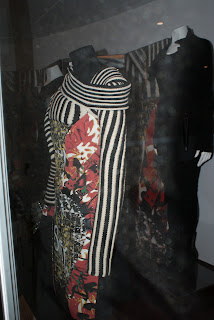
Punk dress: Traditional shape but deliberately untraditional style. Refers to punk fashion culture. Love the wool embroidery in every way, I don't like the way the zips and buckles seem to be forcibly introduced into the design.