Showing posts with label Assignment 1. Show all posts

Tuesday, 30 April 2013

Feedback from my tutor!

I received feedback from my tutor :)

I'm pretty happy with the feedback, there was a lot of encouragement and assurance that I was on the right track - I'm really glad! There were suggestions on what I can do to improve that I extracted and rather than post the whole thing up I'll extract what I think I should work on:

  • Try techniques on a bigger scale e.g. large paintbrush to show effect of different surface textures
  • Utilise skills learnt and continue to be experimental
  • Consider looking at the works of Audrey Walker and Alice Kettle who both use stitch in their artwork, hand stitching and machine stitching respectively. From this I also feel perhaps I should explore textile artists further.
  • MORE MIXED MEDIA, not just pen and pencil. Try collage, wax resist & painting more
  • Try working larger, try out A3 size sketchbooks


So to summarise... 

BIGGER
MORE MIXED MEDIA
RESEARCH CONTEMPORARY TEXTILE ARTISTS


Thursday, 28 March 2013

A Short Reflective Commentary


'Describing your experience of this part of the course using your answers to the review questions for each project as a starting point'
Project 1 Review Post Project 2 Review Post


My experience of this part of the course has had a lot of emotions involved! Fear of getting it wrong, fear that I won’t be as good at all of this as I thought I would be, fear of not finding my own style. I think as I come towards the end of this section I’m getting closer to feeling comfortable with my processes and ways in which I work. I’m more confident now that I can create work I’m really pleased with. I’m also confident now that I’ll be able to home in on my own personal style or look. I’m not saying for a minute that I’m there, but I think the longer I study with this course, and hopefully others, and beyond even the course or degree work, the more I will get that work/develop/style triangular building blocks sorted that will define me and my textile work.

Things I have learnt in this part of the course:
  • Draw, draw, draw and note, note, note. All in one big mish-mash in the sketchbook/workbook.
  • Don’t push forward with anything you’re not inspired by because it will lead to work you are not inspired by.
  • I’m most comfortable with pens and can produce more and explore more in this medium.
  • I like muted colours, so the base colours of my work are best for me when they are muted. This doesn’t mean ruling out brightness altogether, it just means the base colours.
  • When it comes to the point where I feel like taking a sketch further into a textile sample, this is the time to choose materials and continue developmental sketches so that I can have a firm plan of what I’m going to do – I think I work better that way!
  • Stitching-wise I believe I prefer simple stitches with texture becoming involved with choice of materials and yarns.


On my development of my own personal style, I’m not drawn towards the ‘fine art’ aspect of textiles, I’m more looking towards how textiles are used everyday (dare I say the commercial aspect)? I get more of a buzz out of thinking that one day several strangers might have bedlinen or curtains based on my work than thinking one person/corporation might have a piece of work of mine hanging in a room. I guess I’m even looking more towards the interiors market rather even than the fashion market. I posted a video recently that I rewatched where fibre optic lights were used inside carpet. I was more excited about the thought of fibre optics inside carpet, curtains and somehow on ceilings than I was about using on clothing.

Whilst noticing the world around me for textures, patterns and inspiration has improved over this course, its something that I have done for a long time due to other design courses and interests. What has been more important to me, and what this course so far has done for me, is development of my own style and thoughts about how my work might develop in the future.


Sunday, 24 March 2013

Self-assessment using the Assessment Criteria

'Review how you think you have done against the criteria and make notes in your learning log.'

My first thoughts on doing this were that even if I didn't think I was doing well against the criteria I would still send what I had done. There is no point in stressing about not 'getting it right' resulting in sending nothing at all!

So here are the criteria and how I think I have done.


Demonstration of Technical and Visual Skills materials, techniques, observational skills, visual awareness, design and compositional skills.

The pages I sent show that I'm not the best drawer but can certainly get an idea across in my sketching. They show that I'm looking at inspirational areas and noticing areas that can be developed and making notes as to where to explore further which shows visual awareness. I think they show that I'm fairly new to painting mediums but that I'm thinking about light and dark areas and composition. They show that I have some skill in embroidery and am working with unusual materials to get the texture and feeling I want to convey.

Quality of Outcome content, application of knowledge, presentation of work in a coherant manner, discernment, conceptualisation of thought, communication of ideas

My sketch pages are full of both drawings and notes. They show areas where I have explored a concept further and thought about where it can be applied in my textile work. My learning log is laid out chronologically but contains tags for assignment work, learning work and 'broadening' work which means that it is coherant. My communication of ideas is a little bit scattered and rambling, but does convey the points I wish to get across.

Demonstration of Creativity imagination, experimentation, invention, development of a personal voice

I believe that I demonstrate this quite well in my sketchbook, I hope the pages I have sent show this well. I am constantly going off in tangents to explore an aspect more before coming back to the original thread and continuing on that path. I am thinking hard about my own 'style' and direction I want to take my work. I have had to reign myself in a few times because areas I want to explore are in the scope of other courses and I should save that for then!

Context reflection, research, critical thinking (learning log)

Needs work perhaps. I have been to a few exhibitions, spent time in an arts library and have read quite a few of the books and have explored each of these in my learning log. I've also noted what I've taken from each of these forays. I can always try to do more though.


Packing up and Shipping out

So reasons for my little sabbatical for my course include getting married, moving out, setting up our new home and various other things to do with work and life changes. But one other reason was a silly fear of 'not doing it right'. I even had letters from the OCA saying that my student number would be amended to 'dormant' if I didn't return work NOW!!!  

I was confused because I'd read that I should be sending A1 size papers and 2kg of work... I think perhaps this is more towards the OCAs Arts courses rather than textiles. I did measure all my works weight and realised that yes, in theory I could send everything I had done so far and it would come in at under 2kg! But I contacted my tutor and said that I was confused as to what to send, and she did reiterate that it is a 'sample' of work.

So I chose around 6-8 of my favourite A3 pieces which contain my assignment work, still spanning across the course to try to be representative. I  enclosed these in blank A3 card to stop them from getting crushed.
I chose around 8-10 Sketchbook pages, again, choosing my favourites. I think I was concerned that if I were to be truly 'representative' then I should include some rubbish ones... but I'm clearly going to send the best when it comes to assessment so why under-represent myself now?!
Finally I included a sheet with my address and my learning log URL.

All bubble wrapped up...

 And now placed in the OCA provided bag. I used myHermes to send it off, It cost under £5 so I believe this is much cheaper than Royal Mail, and it got picked up from my house :)

I'm not sure if what I've done is *right*. I'll update this post later if I find out. I hope this might help other students get over any similar 'fear'!

Project 2 Stage 6

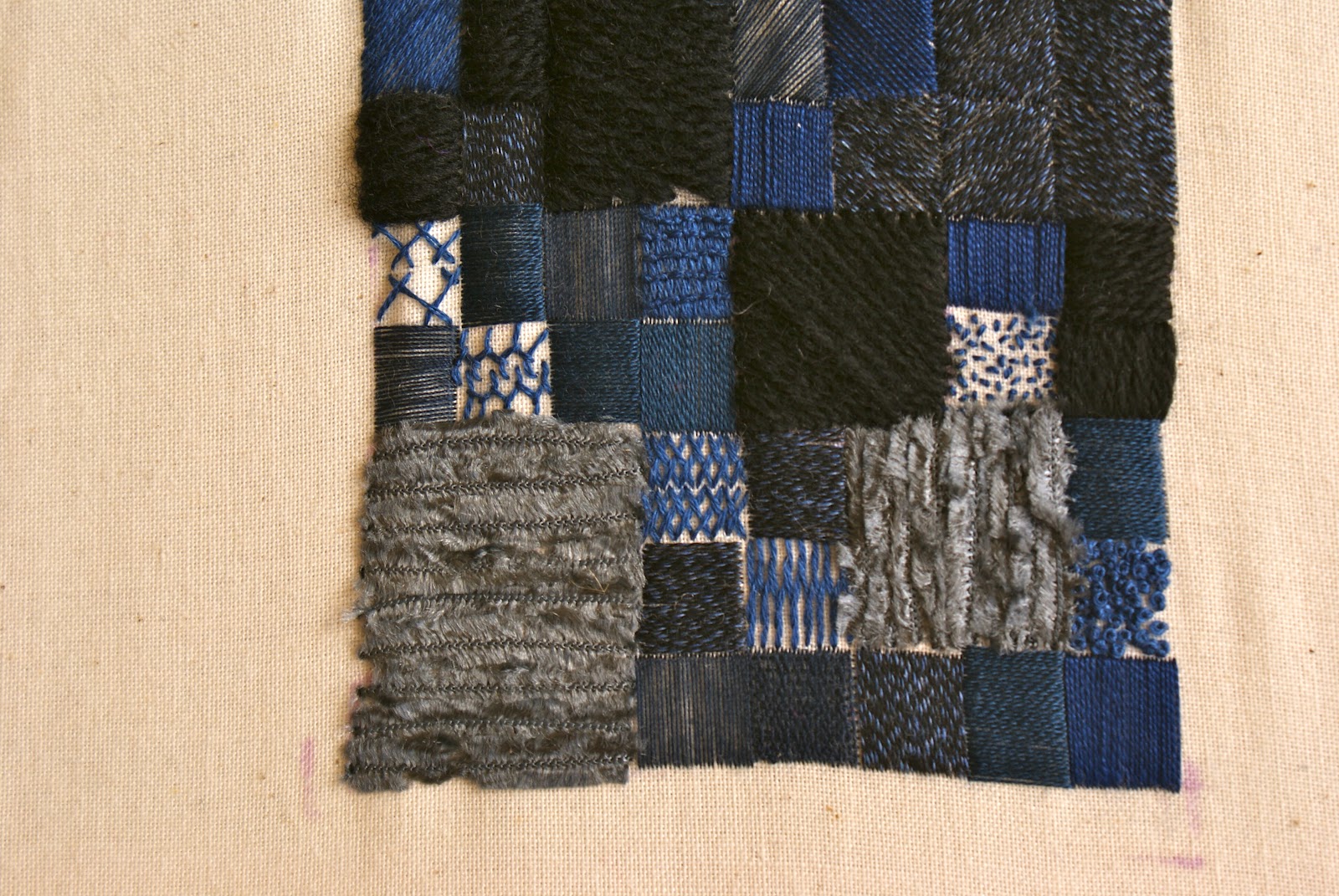
Creating a sample from my sketchbooks. As you might have seen in my sketchbook pages update I gave myself a bit of a written telling off for not using colour more. I realised that by choosing a sketch with colour and texture I had to narrow myself to around 6 images, a few of which I'd already stitched!

I decided on a slate image and wanted to go with a more scrappy look, as my previous samples were more rigid and 'designed'. I prefer the more ordered look but wanted to try to stretch myself.

The course said to select the yarns and wrap them to create a sort of sample board. I guess looking back I could have realised at that point that the colours are not exactly 'blending' and don't look very slate-like at all!

The sample itself I did enjoy doing, though I quickly saw that the effect I had in my head was not going to translate onto the work!


Perhaps I need to loosen up in some ways, but still put thought into the process, maybe if I'd had more thought in my yarns the finished sample wouldn't look such a mess. But then again I think it looks a mess just because it is not really my style! I still show the shapes of tiling, and there is an element of the reflections you see on a wet tile in the sunshine.

Review and reflect....

Can you begin to see the relationship between stitching and drawing?
Yes, I think I grasped this in Project 1 - marks made on paper and on fabric are essentially the same thing, though obviously they each have their own properties (stitching having 3 dimensionality for example).


Were you able to choose stitches which expressed the marks and lines of your drawings?
I mainly stuck to running and satin stitches because of the nature of my lines. I did go further in the last sample but the stitches didn't necessarily 'represent' the lines or texture I had made on paper.

Did you choose the right source material to work from?
I worked from drawings that were originally inspired by my photographs of man-made textures and patterns. I really enjoyed this and believe that yes, I chose the right source material.

Do you think your sample works well irrespective of the drawing? Or is your sample merely a good interpretation of your drawing?
My final sample... no! I think that this is a good way to explain how I feel about that - that it is merely an interpretation of my drawing and doesn't stand up on its own two feet! HOWEVER, my previous sample - "If you have time, work a small sample trying to relate some of these effects to your drawings", show below, I think that does work well irrespective of the drawing, and I'd love to explore this style further. I can see it being an amazing cushion or even wall art.


Which did you prefer - working with stitch to create textures or working with yarns to make textures? Which worked best for you and why?
I think that that maybe I haven't explored enough with the different stitches. I love pretty much everything that Sharon of PinTangle does and particularly her textures created with stitch. However, I think I preferred best working with yarns to create textures - I love the simplicity of basic stitches and bringing in different yarns within those stitches to create texture.

Make some comments on individual techniques and sample pieces. Did you experiment enough? Did you feel inhibited in any way?
Even just answering these questions I think my 'style' will probably go down the more subtle, simple route. Creating texture with choice of materials and pattern. I think I experimented enough without taking eons to complete this section of the course (I could sit down and continue for years making endless variations to see 'what if I'). I don't think I felt inhibited in any way other than time.

Do you prefer to work from a drawing or by playing with materials and yarns to create effects? Which method produced the most interesting work?
Definitely working from a drawing. If my preference for my samples were on a basis of 1-10 then my blue squares sampler and cobbled roundabout sampler shown above would get an 8 whereas my 'just go for it' tiles would get a 2. I know I was working from a drawing on the final sample but I was deliberately just kind of playing and letting go. However I do think that if I play with fabric and yarns (without stitching together) then I can try to get an idea of 'what if', then sketch, then stitch a sample if theres anything I think 'could work'.

Are there any other techniques you'd like to try? Are there any samples you would like to do in a different way?
Yes and Yes. Hundreds. Too many to count. I feel like I want to try the cobblestone sample in infinite other ways with different patterns/yarns/stitch placements for example. And I feel the same about other samples and other drawings. I'm itching to try other techniques but know that many will be covered, if not in this course then in others.

Is there anything you would like to change in your work?
There are some things I would change from the work I've already produced should I ever create the same sample (I guess thats the whole point of creating a sample...). I'd never even consider going back and changing something now. In the *way* I work, I'm going to be focusing more on pouring my thoughts into the sketchbooks/workbooks rather than saving it for a blog post. I'm going to think more about the materials and make more sketches of an image I want to sample before stitching.

Presentation of samples

I've probably put myself under more stress than necessary by sewing my samples taught around some thick card stock - I've done this for samples outside of the course so I automatically did the same here. I do think it looks nice though, and once I actually get round to doing it it doesn't take that long. 


Friday, 17 August 2012

Project 2, Stage 5 Sample

Since I do have time in my 2-month-per-Project scheme, I decided to do a sample with the filling stitches. I really wanted to play around with the stone circles I sketched back in June. These came from a mini roundabout in my town. I really liked how just by putting the 'stones' in wherever goes easiest in the circles that get larger and larger your eye naturally starts to see 'spokes'.


I chose green cotton fabric from curtains that I was making for a salon and decided to use old ripped holdups to dull down the green. The wool I used was variegated in a roughly mossy colour scheme. I like how the pops of brighter, less realistic colour, like pink, actually highlight the colours so it seems more vivid.


The 'stones' are in a simple satin stitch and I worked each stone before moving onto the next so that they look uniform rather than stripy. I was ridiculously pleased with the result:


I let it loosen from the frame as I had expected that the stretched hold-up fabric would cause it to pucker, but it laid perfectly smoothly - I guess the satin stitching evened out the tension.


I think what I like most about the sample, other than the colours which are very definitely 'me' with their muted vibe, is the juxtaposition between the shine of the background and the rough bulk of the wool stones. I also like how the rips of the nylon make the whole thing look more organic and give extra interest in the background. I really love it. I originally thought I'd fill in the gaps with french knots but thought the sample looked good without them. Then I had a chat to myself and thought I should at least TRY them,  since it might look even better and anyway - this is a sample not a finished piece, and I can't keep treating samples like they are a finished artwork!

In the meantime I thought I'd see what a bit of french knitting looked like weaved between the stones (though I didn't stitch it down, its good to see the effect though).


 Heres with some french knots added (in a blended navy/black cotton if you're interested). I thought I'd be putting them in more densely but as soon as I'd started in the centre I realised it wasn't doing anything for the textile. The thing I loved (the matt against the shine, and the definition of the stones) was being lost and marred by the knots. I kept going to see what a few different densities did but I know I prefer without the french knots. At least I tried though and I'm glad I did.


Friday, 3 August 2012

Project 2, Stage 5

Firstly, I did some freehand machine embroidery - lots of fun! I took some inspiration from some of project 1s exercises. Its really hard to go in straight lines so I think the best way is to embrace the sketchy nature of machine embroidery - the circles and the scribbly shading example look the best. I ended with a little test adjusting the tension but couldn't seem to find much difference in the three rows - perhaps something to look at further.


This last sample took me a few days! I started out with light  blue stranded cotton in different directions, I've then branched out to try different colours, silk, perle cotton, cotton blends, wool, sewing thread and chenille. I also introduced different directions in the satin stitch and made sure I had a diamond shape and chevrons. Towards the bottom I did a few small samples of different stitches. I made notes in my sketchbook referencing various aspects.


I always work my samples onto 6x4 inch sized rectangles, its something I decided a few years ago after becoming obsessed with Sharon Bs blog and her never-ending band sampler. I love all the random experiments being tied together with one uniform shape. But I can't help but feel my recent obsession with slate and rain has crept into this sample!


Tuesday, 31 July 2012

Project 2, Stage 3

I chose this image from my sketches because I found it sufficiently varies with thick and thin lines with curves, straight lines, broken lines and crossing.

and heres the completed sample - I think I could have explored some filling stitches early but perhaps I'll come back to this! I added the chain instead of thick lines as I thought it added well, I also wanted to experiment with something a little different!

Looking at this on the computer I think I can still keep adding thick and thin lines for a while yet - perhaps thats what I'll take from this - for a plain background more is more!


Friday, 27 July 2012

Research Point - V&A Exhibition

A picture in the V&A magazine wowed me recently and made me want to see the Heatherwick Studio, Designing the Extraordinary Exhibition in the V&A. My fiancé and I managed to go yesterday on a jam packed day out in London. You can see the original picture and my attempt at scetching it in this sketchbook page from the end of June.


So I wanted to take this exhibition as my next research point. I was worried that an architects studio might not really work for the sort of inspiration I'd be looking for. I was completely wrong! 

There was a hiccup though... I knew photography would not be allowed so I happily started sketching my first chosen focus piece to be told off - sketching was not allowed! I was a bit flabbergasted by this but understood that it is probably because Heatherwick Studio is still a commercial venture and they probably didn't want the intricate mechanisms of their creations copied. Of course anyone can go to the actual installations and sketch, photograph and copy from the source but thats by-the-by! I wished I could have properly sketched (and I saw several other people have to be told to stop sketching too), but I decided that I could still sketch various details from memory and also from referencing photos on the internet. If I ever have time I might also try to visit some of the creations in real life.

Here come the questions...
Is there a theme?
Yes. Heatherwick Studio, it's creations and it's methods.

Is it well displayed?
Yes, there was one large room with a lot crammed in but each item could be looked at from various angles. 

Is the lighting appropriate?
It was nice and bright - there were no delicate artworks or old items to protect so lighting was no issue.

Is there enough explanation of the exhibits?
Yes. Each item had a plaque with a pleasing amount of information and scattered about the room were more plaques with information about the studio itself. There were also video points which showed short clips which I really enjoyed.
Is it visually stimulating and interesting?
YES. Mainly because the exhibition let the designs of the studio be the inspiration. There was nothing else thrown in to distract you but the designs and concepts were enough.


The three exhibits I chose were 'Gazebo', 'Bleigiessen' and a cloud of welded discs bridge structure. The first two are actually realised but I think the last one was a studio experiment that hasn't actually been built (though I may be wrong, I think it was designed for a private home).

To what extent to the pieces refer to tradition or another culture or a period of fashion?

I think despite their super-modern overall appearance each of the pieces do refer to tradition in some way. The attention to detail and the aim to create something that is made well is paramount. In the Gazebo advanced carpenty skills have been used to form the shelter. In Bleigiessen wooden forms are used to space the beads - in some ways its a huge 3d beaded curtain!

What qualities do you like or dislike about the pieces?

I like the overall sensuous and natural shapes in each exhibit. I love the attention to detail and the determination to make a quality constructed object of beauty and also of form. The only thing I could think of that I disliked is of the disc cloud bridge - I didn't like the way the bridge walking surface was formed and I didn't like that when you got close you could see all the joins and it wasn't as smooth as it could be.


Here are the few sketches that I could make from memory...

Monday, 23 July 2012

Project 2, Stages 1 & 2

Stage 1 - Preparation. I chose a simple calico and stuffed three bags full of embroidery threads, wool, ribbon, lace and speciality threads. The three bags correspond to themes rather than colours. They are...
beach, galaxy and slate.


After the prep stage 2 started with lines, first in bands coming closer and closer together. I continued the theme till I had a sort of undulating pattern. The course book suggested to go with the flow so I did!


Then we are instructed to change it up with different lines and crossing in and out. I chose just two threads in similar colours and worked with the thin and the thick. It said to keep going until you've exhausted all possibilities to which I say 'thats rubbish'! As otherwise I'd be on this stage for years!

Saying that I really enjoy the section that is criss-crossed, I like the little raindrops (or sperms, depending on how you look at them)!


Finally I tried some other stitches and tried two versions for each stitch of what the stitches look like up close and personal. I'm not liking how much puckering I've let happen - I'll have to revisit the basics! Hopefully this will come out with an iron on a cloth!


Thursday, 28 June 2012

Project 1, Stage 4

The last stage for project 1 was working from my sketchbooks - again making textural studies. It asked for 4 or 5 images to work from so I then only made 2 textural studies for each. I feel partly guilty that I'm not doing more but I don't want to go on forever!

I ran out of A3 paper today so I've had to order another book - in the meantime here are all the separate studies arranged around the 5 focus areas.

And since I now have the A3 book here they are all glued in....


Now is the time to reflect upon work so far...

Have you ever thought about drawing in this way before?
Actually I sketch A LOT but I tend to sketch things like my dream house layout or website designs or dress designs rather than sketching for the sake of sketching. My sketching has always been for a design rather than for the art itself. I've enjoyed sitting down and forcing myself to draw. 


Were you able to be inventive about the range of marks you made?
I don't think so!!! I looked at a lot of other students blogs so I think I had over-saturated my brain. Those moments where I was a bit more out of the box and free-flowing I didn't think turned out so well. I do think I've been quite inventive in my sketching at moments though so I think the exercises have opened me up a little bit creatively.

Did you explore a wide range of media?
I explored all the media I have and I don't want to go purchasing any more! I've used crayons, pencils, ink, felt tip, watercolour (hard, liquid, crayon, pencil), acrylic, gouache, chalks. On a few different papers - perhaps not quite as exploratory with the papers but I had to reign it in somewhere.

Are you pleased with what you've done? Will it help you to approach drawing more confidently?
I look at my work and I sometimes I think 'it looks like a primary school kid did it' and sometimes I'm really happy with it. There are definitely some pieces that I'm thrilled with though so I have to take that as a plus. It will help me to approach drawing more confidently in that I'm more confident about starting. I'm not any more or less confident that the actual result will be pleasing!

Which exercise did you most enjoy? Why?
I enjoyed Stage 3, Exercise 1 the most - making textural studies based on images. I enjoyed it the most because I could take a starting point that I was already inspired by. I also found it interesting because I could analyse *why* I loved the image i.e. colours, textures, patterns, contrasts etc.

Which media did you most enjoy working with? Why?
Pens. I did enjoy painting but I do not enjoy the faff associated with getting out, putting away, tidying up. I love the quickness of pens, the depth of colour that I can get, the tidiness, the portability. I don't even want to try to force myself to use other media because I think instead of producing more work I'll end up doing less.

What other forms of mark-making could you try?
A lot! I know I could have gone on for a long time but I was conscious of time and also running out of inspiration and focus. I've seen posts from other students and other creative sources for different styles of sketching, painting and some amazing mixed media. But I'm happy with what I've done for Project 1 and know it will help for the upcoming projects.


How will these exercises enrich your textile work in the future?
I'm more focused on textures, how lines are put together, what media might be best to test out a design or to prototype an idea. 'Sketching' does not necessarily mean just using a pencil to me now. I'm happy to explore the varieties of an idea. All of these things can only help to enrich future work.

Any questions for your tutor or any points that you specifically want to remember?
Not really notes or questions for my tutor other than "Am I doing this right?!" It is a little hard to do via distance learning if only because I think I crave approval!


Points that I specifically want to remember:


* When I'm truly inspired by something that seems to often be when I produce the best work.
* When I 'force' something it often ends up disappointing
* I like dark and/or muted colours. I'm not going to struggle against it!


Notes for continuance of the course:


* I still haven't completed taking photographs of man made things relating to texture, groups of objects, looking into the distance etc.
* I need to go to another exhibition - I'm planning to go to one soon but its an architecture one - I'll have to see what sort of exhibits are there before I can decide I can properly relate it to textile studies.
* I've stalled on my reading. I'm currently on 'Drawn to Stitch' by Gwen Hedley and I'm struggling with the repetitiveness of the course textbooks i.e. Its good to sketch. Take a notebook with you everywhere you go etc etc. I've allowed myself to get slightly annoyed by taking an 'I know it all attitude'. Time to rein that in I think...
* I've been doing the work on time but updating the blog (with retrospective dates) in big pushes at later dates. I'm happy with this but wanted to note it down here in case anyone gets confused by checking in one day and seeing no posts then another day to see weeks worth backdated!


Tuesday, 19 June 2012

Project 1, Stage 3, Exercise 2

Similar to the last project - textural studies except with real objects rather than just images. I'm going to stick photographs of the objects (a flower, a leaf and the dilapidated paper cover of a saw) next to these images on the A3 sheets. Again, I found it hard in some cases to 'let go' of just copying the object and in other cases I wasn't happy with the actual result.

I like individual qualities of some of the work I've done here, and I can definitely see how elements of each might inspire further work so I'm not completely downhearted about this exercise.


Sunday, 17 June 2012

Project 1, Stage 3, Exercise 1

This one asked me to work from visual sources which I used a postcard and magazine adverts. It was a 'textural study' so the idea was to capture the 'feel' or 'idea' of something rather than just copying. I found that easier in some cases than others. Especially the advert with the chandelier and mirror - I think I found it so beautiful that I didn't want to ruin it by changing anything - I think I should have pushed the boat out a little more on that one as my results were a little 'blah'!


I really liked some of the results but again others I was a bit unhappy with. I think it was because when I first looked at the image I thought that I knew exactly what I wanted to produce and the reality didn't quite match up - I guess thats what sketching, creating samples and prototypes is for!

I also felt a tiny bit like the first, 'most inspired' pieces I produced were the best, and the 2nd and 3rd pieces that were more 'forced' weren't as good!

Wednesday, 13 June 2012

Project 1, Stage 2, Exercise 4

Blimey I got stuck on this exercise! It seemed so much to do! The thing I felt most confident on (collage) I left till last then got a massive block and didn't finish for a long time. I know that the possibilities of each of these methods are endless and want to show a 'decent' cross section but also start/concentrate on the basics. I also wasn't massively impressed with the results - many of my pages look very pre-school which turned me off the exercise a lot!

 Fixative transfer didn't work for any of my magazines but did work for gardening seed catalogues. I found that rubbing over them with a pen worked better than pencil or crayon

Bleach didn't work on some of my papers and fabrics (nylon lace, bright felt and polyester were unaffected) it worked best on the bright red tissue that came with my OCA folder

Spraying acrylic mixed with water with stencils and with just the spray bottle

Stippling and sponging with stencils with acrylic

Rubbing away and combing with gouache

Block printing with bottle tops, corks, fingers, stamps, foam stamps, comb etc

Crayon rubbings and wax resist

Collage

 I liked some of the effects and know how I might use them in the future - actually DOING some of the techniques opens up further uses - a very valid exercise even if I didn't like the results as much as I could hope! This has been quite a long time in the making, I hope I don't get as 'stuck' on future exercises.


Tuesday, 22 May 2012

Project 1, Stage 2, Exercise 3

Exercise 3 involved using other media to make marks - first in an exploratory way then coming back to the expressive way. 

I tried out all the bits and bobs I have - pencils, watercolour pencils, crayons, watercolour crayons, ink pens, felt tip pens, metallic pens, watercolour, gouache, acrylic, spray paint and chalks. I tried on a few different papers but had to limit myself a little bit. I knew there are millions of different combinations but I started to get a little bored so I moved onto the expressive marks. 

I enjoyed the expressive marks but making such a huge mess, tidying as I went and getting bits and bobs out and away again takes time! I felt drawn to some experiments and felt that others were just ugly! I find it strange that I find the 'sad', 'slow' and 'smooth' expressive swatches the most appealing too - I guess its because I like those colours and like the calmness. Sometimes I'd have an idea in my head, set to it and found that the result didn't really express what I was trying to at all - but I guess that it what its all about!